


TPL Insurance
Strategic Digital Evolution.
UI/UX Design
2 Weeks
Insurance
Concept Proposal
Problems in the
Old Design.
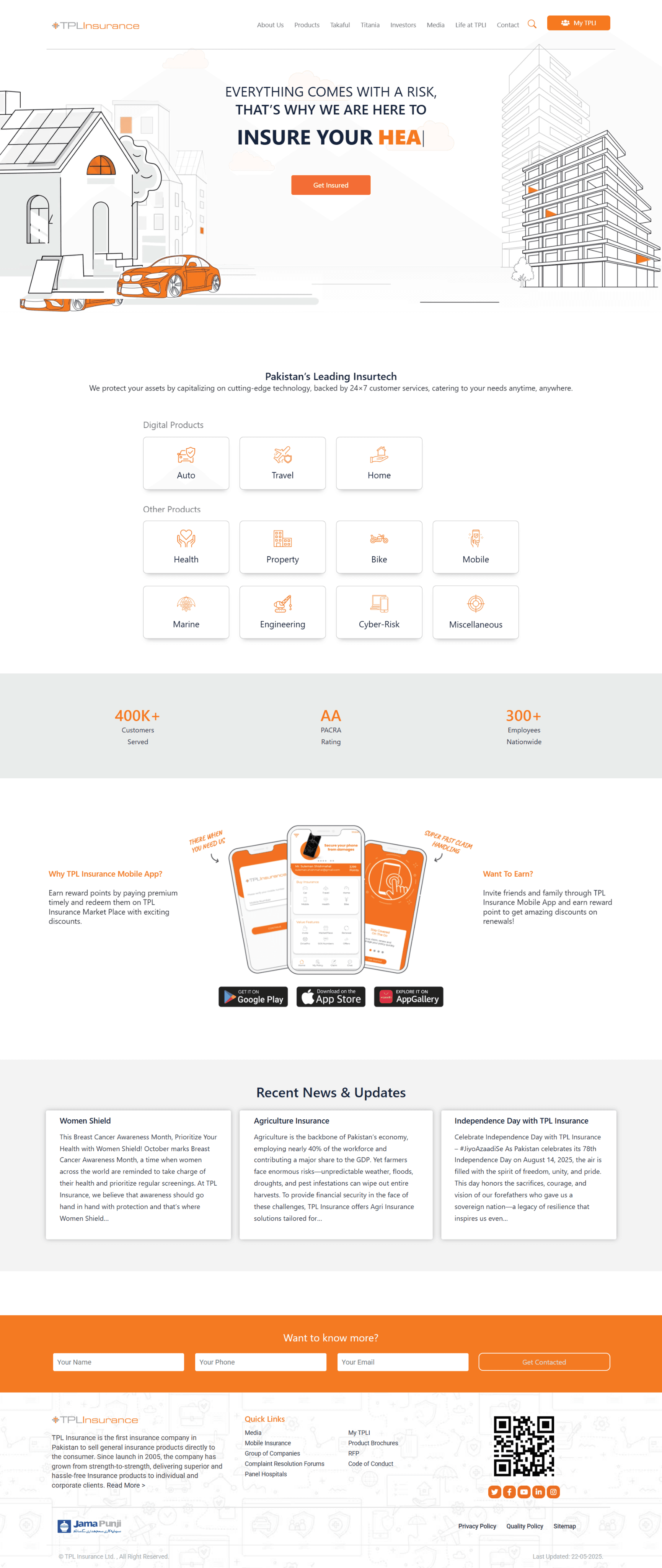
The legacy platform struggled with a rigid corporate aesthetic and fragmented user journeys, creating a significant trust gap for a new generation of digitally-native customers.
Strategic
Design Goals.
Our goal was to transform the insurance-buying experience from a complex chore into a seamless digital journey, leveraging visual clarity to establish authority and drive conversion.
Before vs After
Design System.
A cohesive system of components, typography, and colors designed to scale across the entire digital ecosystem.
Color Palette
Brand Orange
#FA842F
Warm Canvas
#FFFCF6
Slate Footer
#4A4F55
Deep Paragraph
#27344C
Typography Scale
Heading Display
Poppins - SemiBold - 64pt / -0.04em
Secondary Heading SemiBold
Poppins - SemiBold Italic - 32pt / 0.02em
Body text is designed for maximum legibility on digital screens, using a balanced leading and tracking.
Poppins - Regular - 14pt / 1.6 line-height
Psychology
Behind the Design.
Beyond aesthetics, the redesign was engineered to influence user behavior through proven psychological frameworks, ensuring every interaction feels intentional and effortless.
Reduced Friction
Large, clear CTAs were strategically placed to guide the user through the funnel without cognitive overload.
Content Scanning
Card-based layouts improved the ability to quickly scan insurance types and find relevant services.
Attention Guidance
Bright accent colors (TPL Blue) were used to draw focus to actionable elements and key value propositions.
Credibility Building
Clean aesthetics and high-quality imagery directly correlate with increased trust in the financial sector.
Mobile First
Experience.
In an era where most insurance claims are started on the go, the mobile experience is not an afterthought — it's the primary touchpoint.
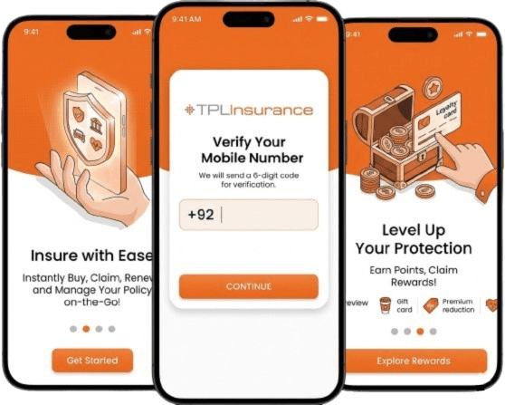
Final Outcome
The resulting concept redefines TPL’s digital footprint, bridging the gap between legacy reliability and modern user expectations. By prioritizing cognitive ease and emotional trust, the redesign positions TPL not just as an insurer, but as a forward-thinking digital leader.